Theming
Every EasyBI control (designer, dashboard, filter bar, field list, KPI and table renderers, chart connectors) draws with resources looked up dynamically: an application restyles EasyBI by defining them, and switches theme at runtime by replacing the dictionary that defines them. Charts follow too, without querying their data again.
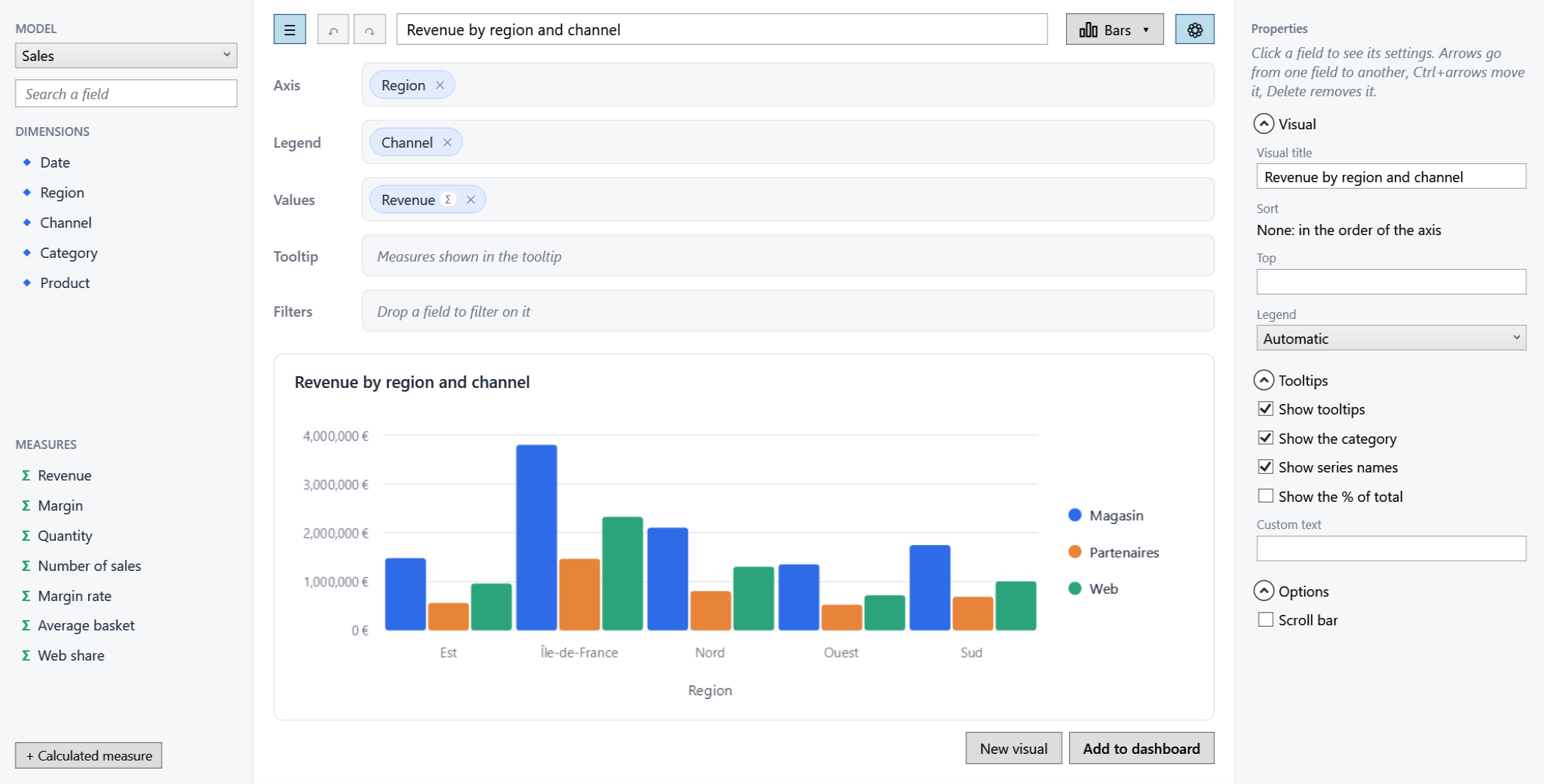
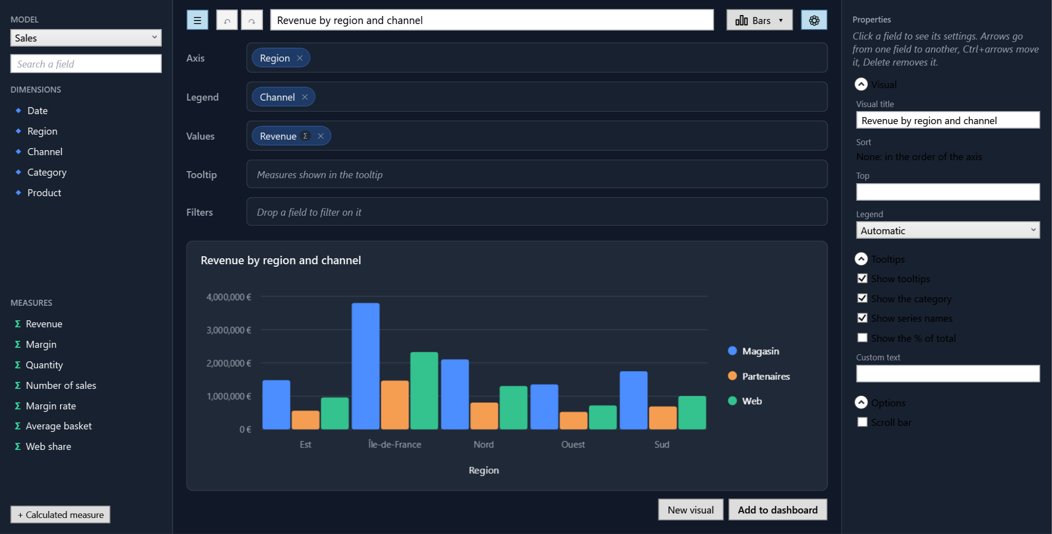
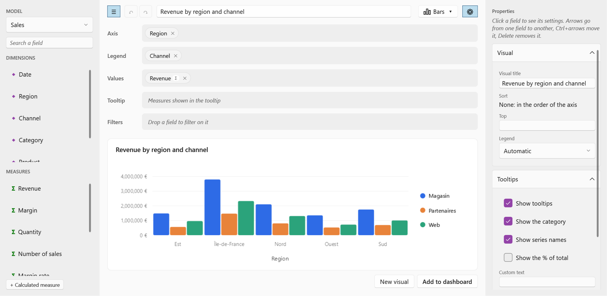
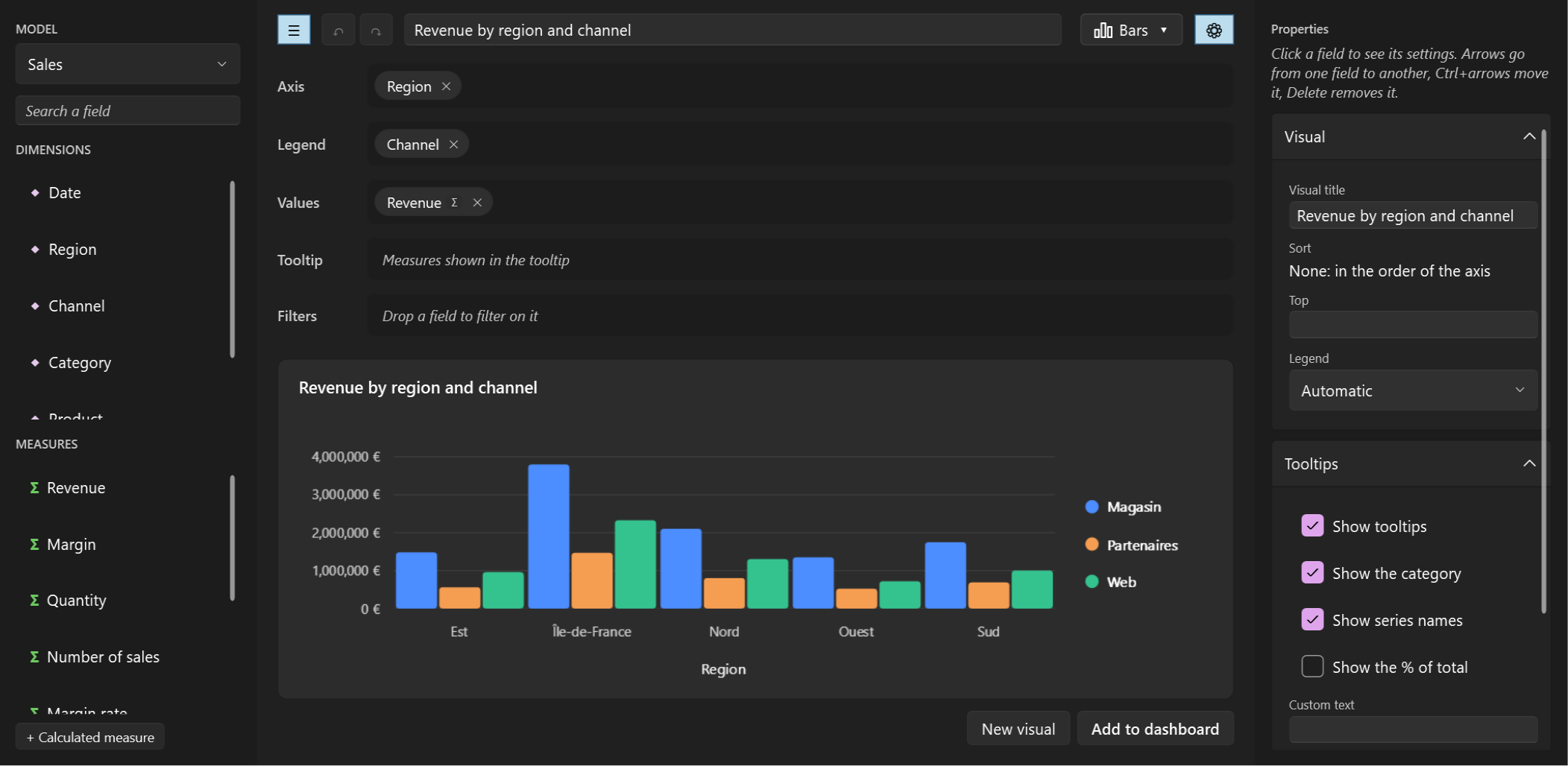
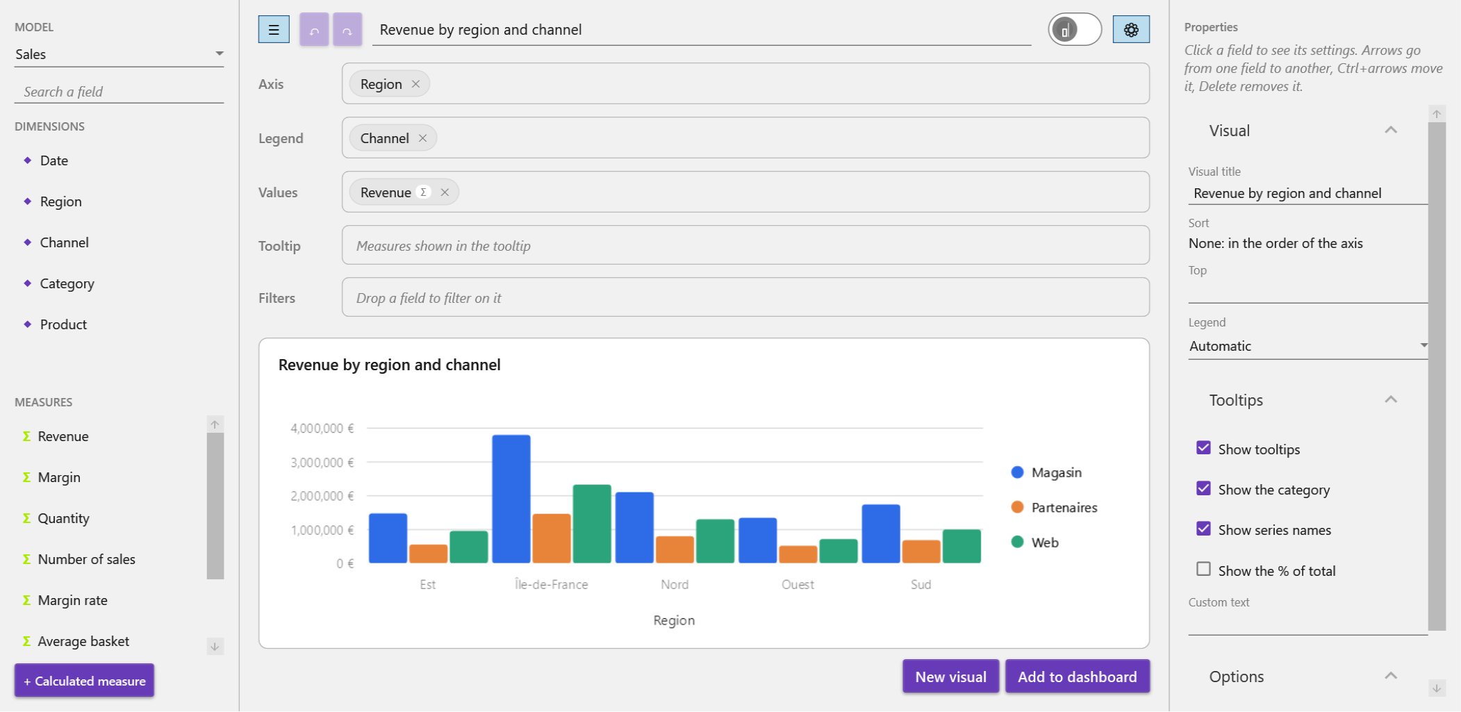
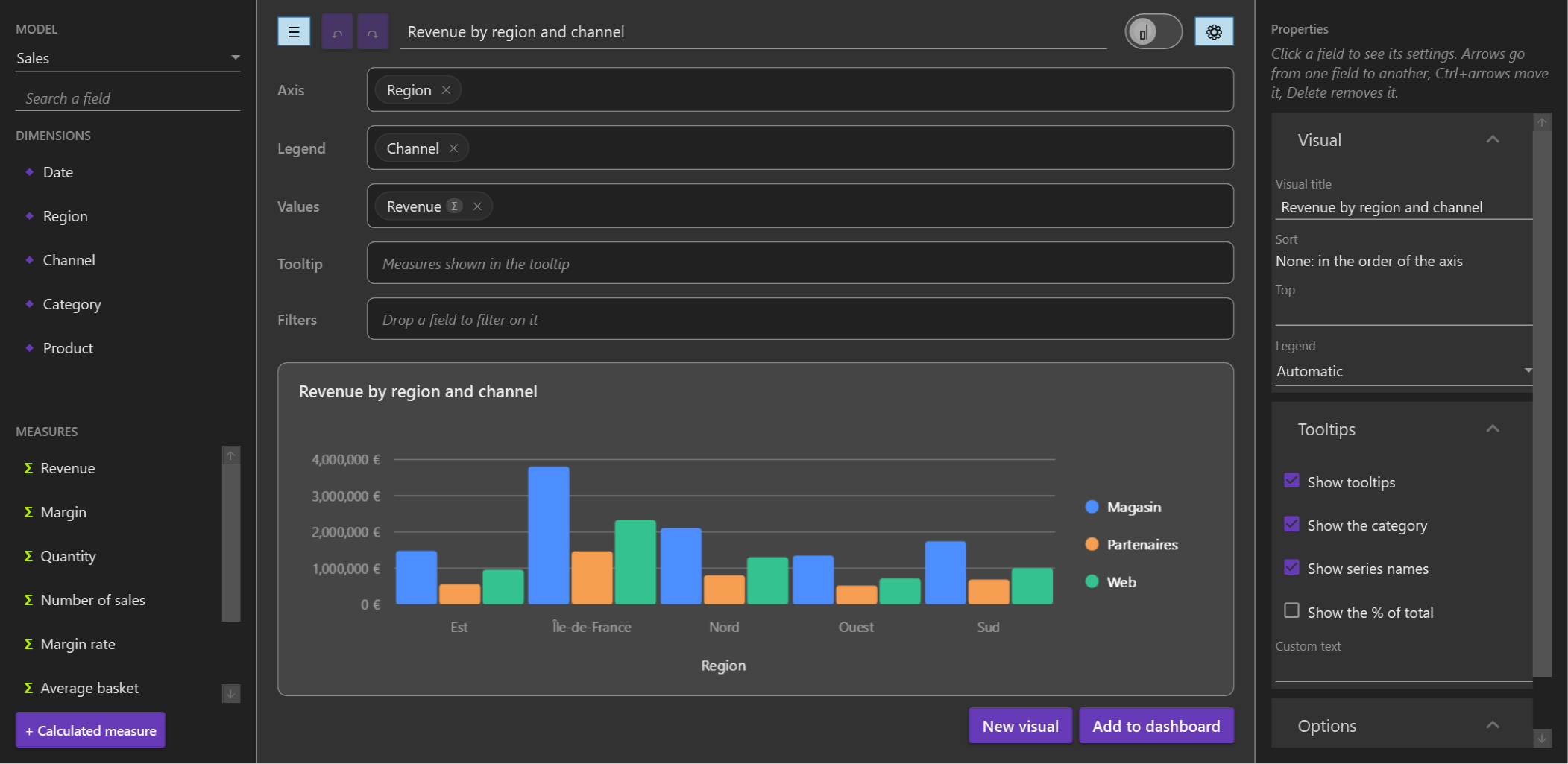
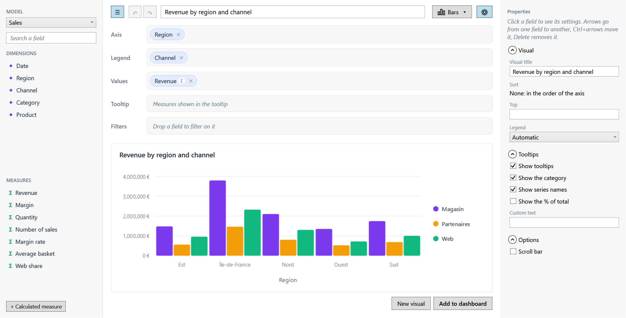
Light and dark
<Application.Resources>
    <ResourceDictionary>
        <ResourceDictionary.MergedDictionaries>
            <bi:EasyBIThemeDictionary Mode="Dark" />
        </ResourceDictionary.MergedDictionaries>
    </ResourceDictionary>
</Application.Resources>
Without it, the light theme applies. To switch at runtime, change Mode (or swap the dictionary):
foreach (var theme in Application.Current.Resources.MergedDictionaries.OfType<EasyBIThemeDictionary>())
    theme.Mode = EasyBIThemeMode.Light;
Overriding a few colors
Define the keys you want in your resources, after the theme dictionary; the others keep the theme's values:
<SolidColorBrush x:Key="{x:Static bi:EasyBITheme.AccentBrushKey}" Color="#7C3AED" />
<bi:ChartPalette x:Key="{x:Static bi:EasyBITheme.ChartPaletteKey}">
    <Color>#7C3AED</Color>
    <Color>#F59E0B</Color>
    <Color>#10B981</Color>
</bi:ChartPalette>
<CornerRadius x:Key="{x:Static bi:EasyBITheme.CornerRadiusKey}">4</CornerRadius>
The complete list, with their light and dark values, is in
Themes/Light.xaml and Themes/Dark.xaml:
Key (EasyBITheme.…) |
Used for |
|---|---|
BackgroundBrushKey |
behind the dashboard, the designer and the visual editor |
SurfaceBrushKey |
cards (dashboard items, designer preview), popups, toolbars, chart tooltips |
SurfaceAltBrushKey |
field lists, designer shelves, empty items, alternate table rows |
BorderBrushKey, BorderStrongBrushKey |
borders and separators; empty items and free spaces |
ForegroundBrushKey, MutedForegroundBrushKey, DisabledForegroundBrushKey |
text, secondary text (headers, hints, icons, axis labels), unavailable options |
AccentBrushKey, AccentHoverBrushKey, AccentForegroundBrushKey |
selection, "+" buttons, drop indicators, and the text on them |
AccentSoftBrushKey, AccentSoftBorderBrushKey |
field chips, selection chip, drop placeholders |
SecondarySoftBrushKey, SecondarySoftBorderBrushKey |
filter chips |
HoverBrushKey |
small buttons under the pointer |
ErrorBrushKey |
error messages, bad values of conditional formats |
SuccessBrushKey, WarningBrushKey |
good and middle values of conditional formats |
MeasureBrushKey |
the Σ of measures in field lists, measures in formulas |
FormulaFunctionBrushKey, FormulaDimensionBrushKey, FormulaTextBrushKey, FormulaNumberBrushKey |
the parts of a formula in the calculated measure editor (EasyBI's values in the Material Design and WPF UI mappings) |
GridLineBrushKey |
grid lines of charts and tables |
ChartPaletteKey (ChartPalette) |
colors of chart series, in order |
CornerRadiusKey (CornerRadius) |
rounding of cards |
Control-specific parts have their own style keys (DashboardOverlay.PlusButtonStyleKey, FreeSpaceStyleKey,
DropPlaceholderStyleKey, DragSource.PreviewStyleKey... see Dashboard and
Drag and drop), and DashboardItem has an implicit style.
Standard controls
Buttons, combo boxes, text boxes and check boxes inside EasyBI have no explicit style: they take your application's implicit styles, so a control library (WPF UI, Material Design...) styles them too. EasyBI's own light and dark themes color EasyBI's surfaces, text and charts, not the standard controls: with the dark theme and no control library, they keep the system's light look.
Following a control library
With WPF UI or Material Design in XAML, install the matching package and merge its dictionary after the library's:
EasyBI's surfaces, text, accent and charts then take the library's colors, light or dark, and follow its theme switches
(ApplicationThemeManager.Apply, PaletteHelper.SetTheme). Its classes are in the bi: XAML namespace.
<!-- dotnet add package EasyBI.Themes.WpfUi -->
<ResourceDictionary.MergedDictionaries>
    <ui:ThemesDictionary Theme="Dark" />
    <ui:ControlsDictionary />
    <bi:WpfUiTheme />
</ResourceDictionary.MergedDictionaries>

<!-- dotnet add package EasyBI.Themes.MaterialDesign -->
<ResourceDictionary.MergedDictionaries>
    <md:BundledTheme BaseTheme="Dark" PrimaryColor="DeepPurple" SecondaryColor="Lime" />
    <ResourceDictionary Source="pack://application:,,,/MaterialDesignThemes.Wpf;component/Themes/MaterialDesign3.Defaults.xaml" />
    <bi:MaterialDesignTheme />
</ResourceDictionary.MergedDictionaries>
WpfUiTheme.Map and MaterialDesignTheme.Map list which library resource each EasyBI key takes. For another library
or an application's own design system, derive from EasyBIThemeMapping and map the keys you need; unmapped keys keep
EasyBI's light values, while the keys listed in Kept (colors the system has no equivalent for, such as Material
Design's success and warning) and the chart palette follow the mapped background (EasyBI's light or dark values). A
design system with its own chart colors maps ChartPaletteKey to its ChartPalette. If the library
switches theme by swapping dictionaries without notifying, call Refresh() on the mapping afterwards.
ApplicationThemeManager.Apply sets the main window's Background itself: put an EasyBI background on the window's root
panel rather than on the window (as the sample does).
public sealed class MyTheme() : EasyBIThemeMapping(new Dictionary<ComponentResourceKey, object>
{
    [EasyBITheme.BackgroundBrushKey] = "MyWindowBrush",
    [EasyBITheme.AccentBrushKey] = "MyPrimaryBrush",
});
Charts
VisualView passes the theme to renderers in RenderRequest.Theme (BiTheme): the palette, and the Foreground,
MutedForeground, GridLine and Background colors (hexadecimal, null when unknown). It is built by
EasyBITheme.ChartTheme(element) from the resources above. A palette or colors set on EasyBIContext.Theme take
precedence over the resources.