Customizing the designer
Every part of the designer can be changed without rewriting it: add your buttons, hide a part, add your own settings to the properties panel, restyle an editor, draw your own icons.
| To... | Use |
|---|---|
| Add your own buttons | A slot |
| Hide a part | A slot in Hide mode |
| Add settings to the properties panel | PropertiesBuilding |
| Restyle an editor of the panel | A DataTemplate with a DesignerPropertyTemplates key |
| Change the icon of a type | A Geometry with a VisualTypeIconKey |
| Fold the side panels | IsFieldPanelOpen, IsPropertiesPanelOpen |
Add your own buttons
The designer is made of named slots: put your content before, after or instead of each one. The sample puts its New visual and Add to dashboard buttons under the preview:
<bi:ReportDesigner x:Name="Designer" Context="{Binding Context}">
    <bi:Slots.Items>
        <bi:Slot Name="{x:Static bi:ReportDesignerSlots.Preview}"> <!-- (1)! -->
            <StackPanel Orientation="Horizontal" HorizontalAlignment="Right" Margin="0,10,0,0">
                <Button Content="New visual" Click="OnNewVisual" />
                <Button Content="Add to dashboard" Click="OnPublish" Margin="6,0,0,0" />
            </StackPanel>
        </bi:Slot>
    </bi:Slots.Items>
</bi:ReportDesigner>
Mode="After"by default: below the preview, since this slot is vertical.Before,ReplaceandHideare the other modes.
The slots of the designer:
FieldPanel ─ Fields               Header ─ Title, VisualTypes          Properties
                                  Shelves ─ AxisShelf, LegendShelf,
                                            ValuesShelf, TooltipShelf,
                                            FiltersShelf
                                  Preview
Data context of a slot
The content of a designer slot takes the designer's ViewModel as data context: {Binding Visual.Title} works in
it. To bind to your window's view-model, go through the window:
{Binding DataContext.PublishCommand, RelativeSource={RelativeSource AncestorType=Window}}.
See Slots for the modes, inheritance and templates.
Hide a part
<bi:Slot Name="{x:Static bi:ReportDesignerSlots.FiltersShelf}" Mode="Hide" />
<bi:Slot Name="{x:Static bi:ReportDesignerSlots.TooltipShelf}" Mode="Hide" />
Hiding a part does not forbid what it does: to forbid a change, add a rule.
Add settings to the properties panel
The panel is rebuilt from sections of properties each time the selection changes. PropertiesBuilding lets you
add, remove or reorder them. Here, a Notes section for the measures:
designer.ViewModel!.PropertiesBuilding += (_, e) =>
{
    if (e.Selection is ShelfItemViewModel { IsValue: true } chip)
        e.Sections.Insert(0, new DesignerPropertySection(
            "Notes", () => "Notes",
            [
                DesignerProperty.Text(
                    "Comment", () => "Comment",
                    get: () => comments.Get(chip.Field.Name),
                    set: text => comments.Set(chip.Field.Name, text)),
            ]));
};
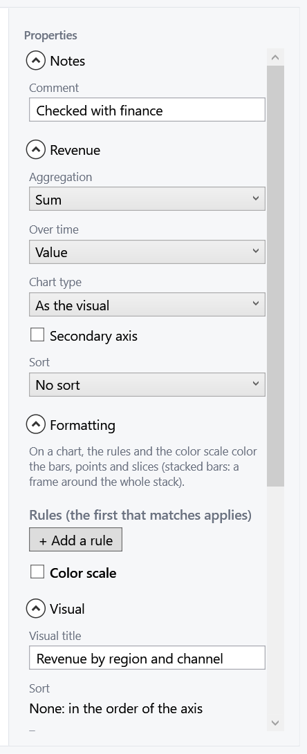
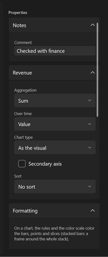
e.Selection |
Selected |
|---|---|
ShelfItemViewModel |
A chip of the axis, legend, values or tooltip (IsValue: a measure in the values) |
FilterItemViewModel |
A chip of the filters |
null |
Nothing: the visual's settings |
Properties come in six kinds, each with its editor:
| Factory | Editor |
|---|---|
DesignerProperty.Toggle |
Check box |
DesignerProperty.Choice |
Drop-down list of Option<T> |
DesignerProperty.Number |
Number box (empty = null) |
DesignerProperty.Text |
Text box |
DesignerProperty.Info |
Read-only text |
DesignerProperty.Custom |
Any object, shown with its DataTemplate |
Labels are functions (() => "Notes") so that they follow a change of language: return a localized string.
Each factory also takes isAvailable (to grey the property) and description (its tooltip).
EasyBI's sections have constant keys, to find or remove them:
var tooltips = e.Sections.FirstOrDefault(s => s.Key == DesignerPropertySections.Tooltips);
if (tooltips is not null) e.Sections.Remove(tooltips);
Field, Formatting, Filter, ValueLabels, Visual, Tooltips, Options (the renderer's options).
Restyle an editor of the panel
Each kind of property is drawn by a DataTemplate whose data context is the DesignerProperty. Define one with the
same key in your resources to replace EasyBI's:
<DataTemplate x:Key="{x:Static bi:DesignerPropertyTemplates.ToggleTemplateKey}">
    <ToggleButton Content="{Binding Label}" IsChecked="{Binding IsOn}" Style="{StaticResource MySwitch}" />
</DataTemplate>
| Key | Binds to |
|---|---|
ToggleTemplateKey |
Label, IsOn |
ChoiceTemplateKey |
Choices (with Label), SelectedChoice |
NumberTemplateKey |
NumberText |
TextTemplateKey |
TextValue |
InfoTemplateKey |
TextValue |
CustomTemplateKey |
Value |
Change the icon of a type
The icons of the gallery are geometries drawn with the foreground in a 16×16 box. Define one with the type's key, for your own types or to replace one of EasyBI's:
<Application.Resources>
    <Geometry x:Key="{bi:VisualTypeIconKey sample.ranking}">
        M1.5,3 L3,3 M1.5,8 L3,8 M1.5,13 L3,13 M5,3 L14.5,3 M5,8 L11,8 M5,13 L8,13
    </Geometry>
    <Geometry x:Key="{bi:VisualTypeIconKey Bar}">M2,14 L2,6 L6,6 L6,14 Z M10,14 L10,2 L14,2 L14,14 Z</Geometry>
</Application.Resources>
A type without an icon shows the one under VisualTypeIcons.DefaultKey.
Fold the side panels
Both side panels fold, from the header's buttons or from your code. Both properties are two-way:
<bi:ReportDesigner Context="{Binding Context}"
                   IsFieldPanelOpen="{Binding ShowFields}"
                   IsPropertiesPanelOpen="False" />
Selecting a chip opens the properties panel, so that its settings show.